Sahapedia: An online encyclopedia on Indian culture and heritage
Strategy, UX, 2011
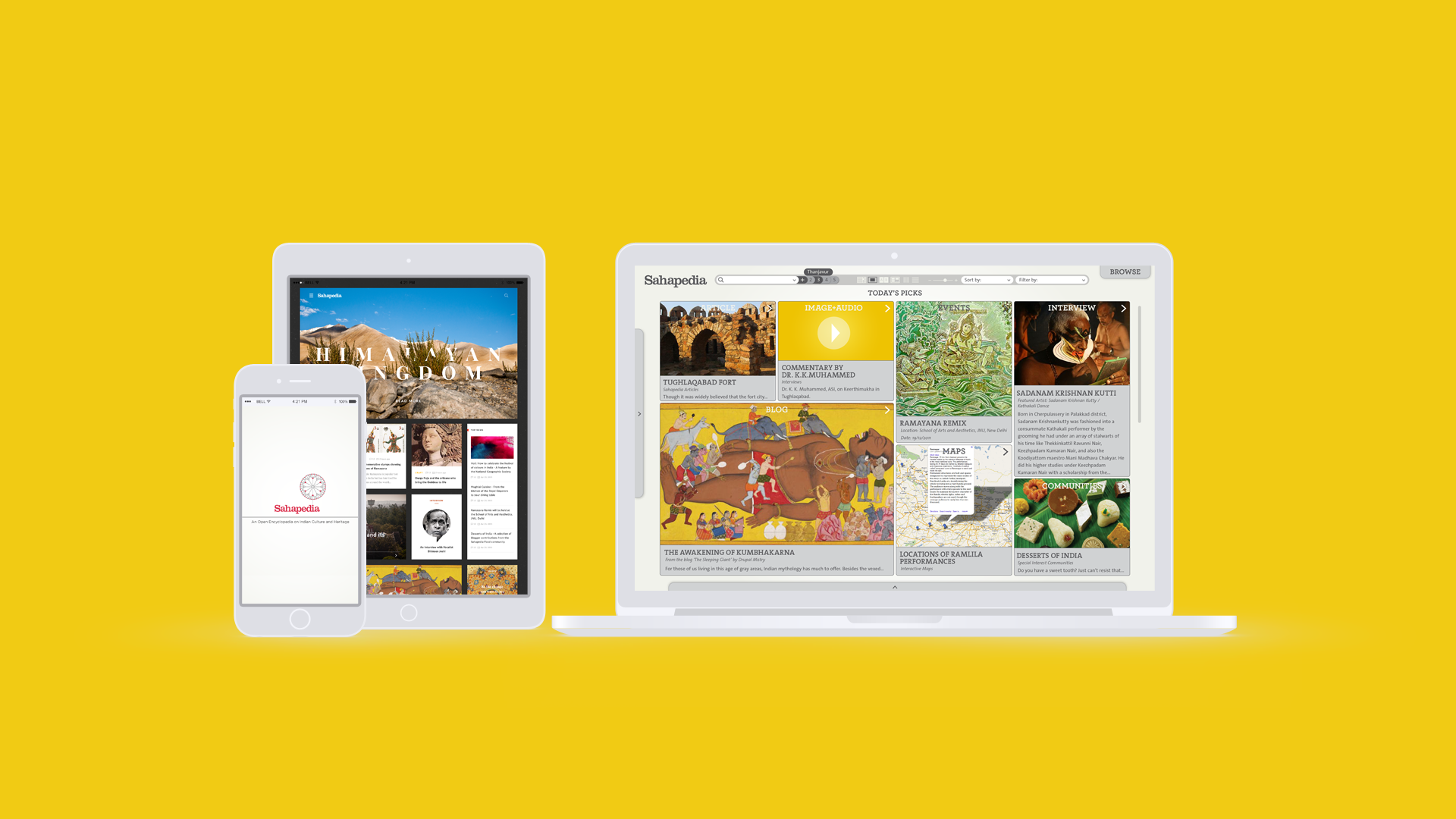
Sahapedia is an open online resource on the arts, cultures and heritage of India.
In early 2011, we designed a Research+Education Platform for Sahapedia, where people (experts and lay users alike) exchange ideas, information and experiences, and contribute their knowledge of Indian cultural forms through multiple media formats.
Sahapedia UX demo video
A demo video we produced in 2011 to explain the concept UX design of Sahapedia for potential investors.
Platform architecture
Sahapedia was designed as an educational research platform that can be used for any subject, simply by switching out the content modules and adapting the tool sets to suit the type of data/information.
To create a modular system architecture, all the complexity at the Information Architecture and UX design level was directed to the back end and built into the system architecture, lowering the mental demand on the user and ensuring a simple and intuitive user experience.
Some of the UX components of the Sahapedia platform:
Content Authoring Tool
Search and Browse Content
Featured Content
Workspace
User Profile Registration
User Community Registration
Visual Engine Design
Navigation
Cross-referencing
User Interaction
“UI elements are context sensitive and designed to recede when possible, freeing up the user’s cognitive load and enabling them to focus on the content.”
Content Authoring Tool
The content authoring tool will create a straightforward environment for content writing. You can simply click and start typing, drag images and other media into place and the text will auto-wrap. There are multiple layers of functionality embedded into the tool, which emerge based on the context of your current activity.
Intuitive design / wysiwyg
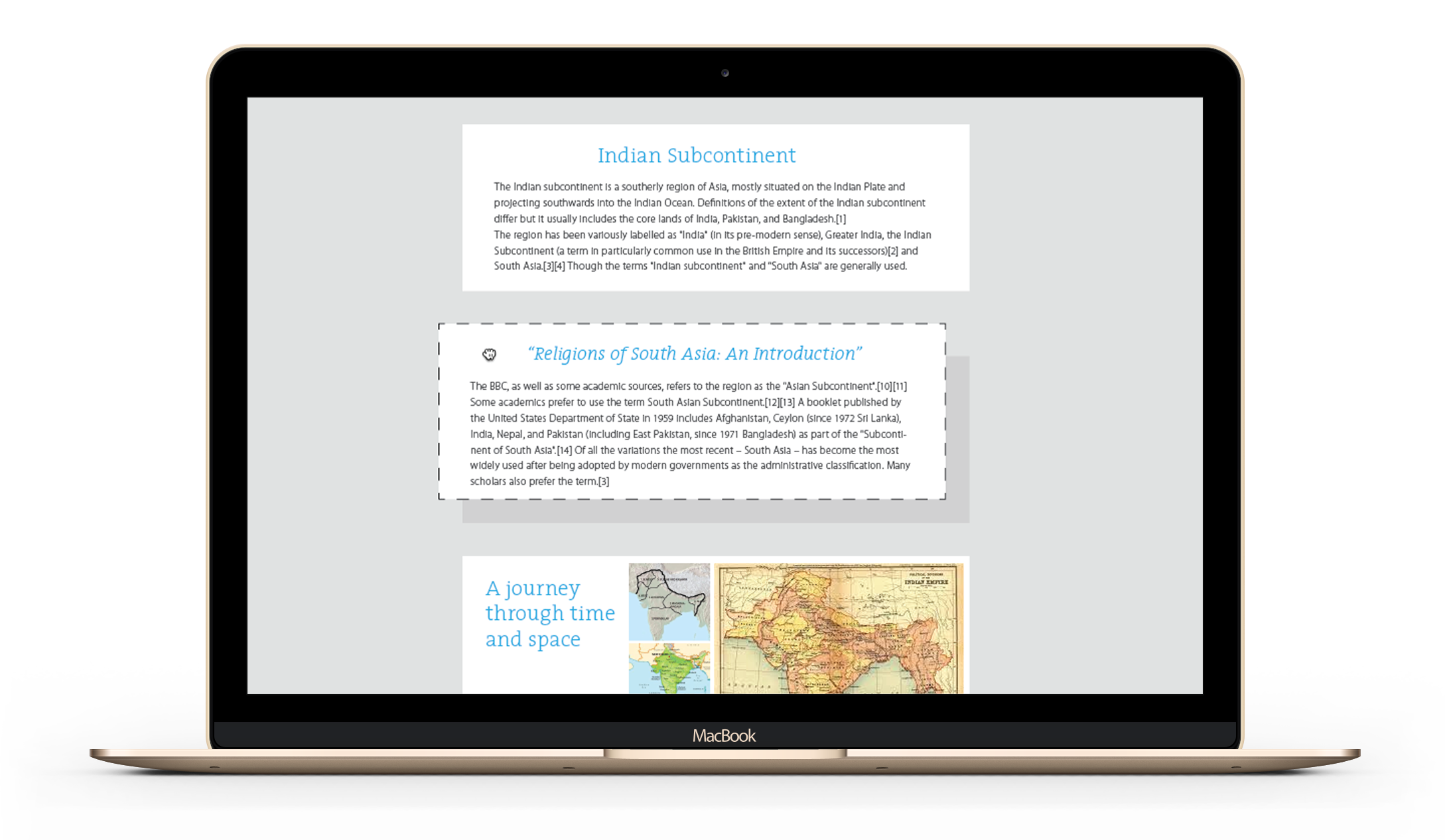
Users can grab blocks of text and move them around easily, zoom in and out to see multiple pages at once, or select pre-made templates and then replace content.
Metadata and tagging
The system will use metadata and semantic analysis to suggest content tags, and extract useful cross-reference data such as dates, names, locations, etc. Users can approve or edit these tags and add new ones themselves. If the user wants, she can add more details to each data point, such as a description, location information, etc. The idea is to reduce the work load on the user by automating data tagging at the machine end.
Featured Content
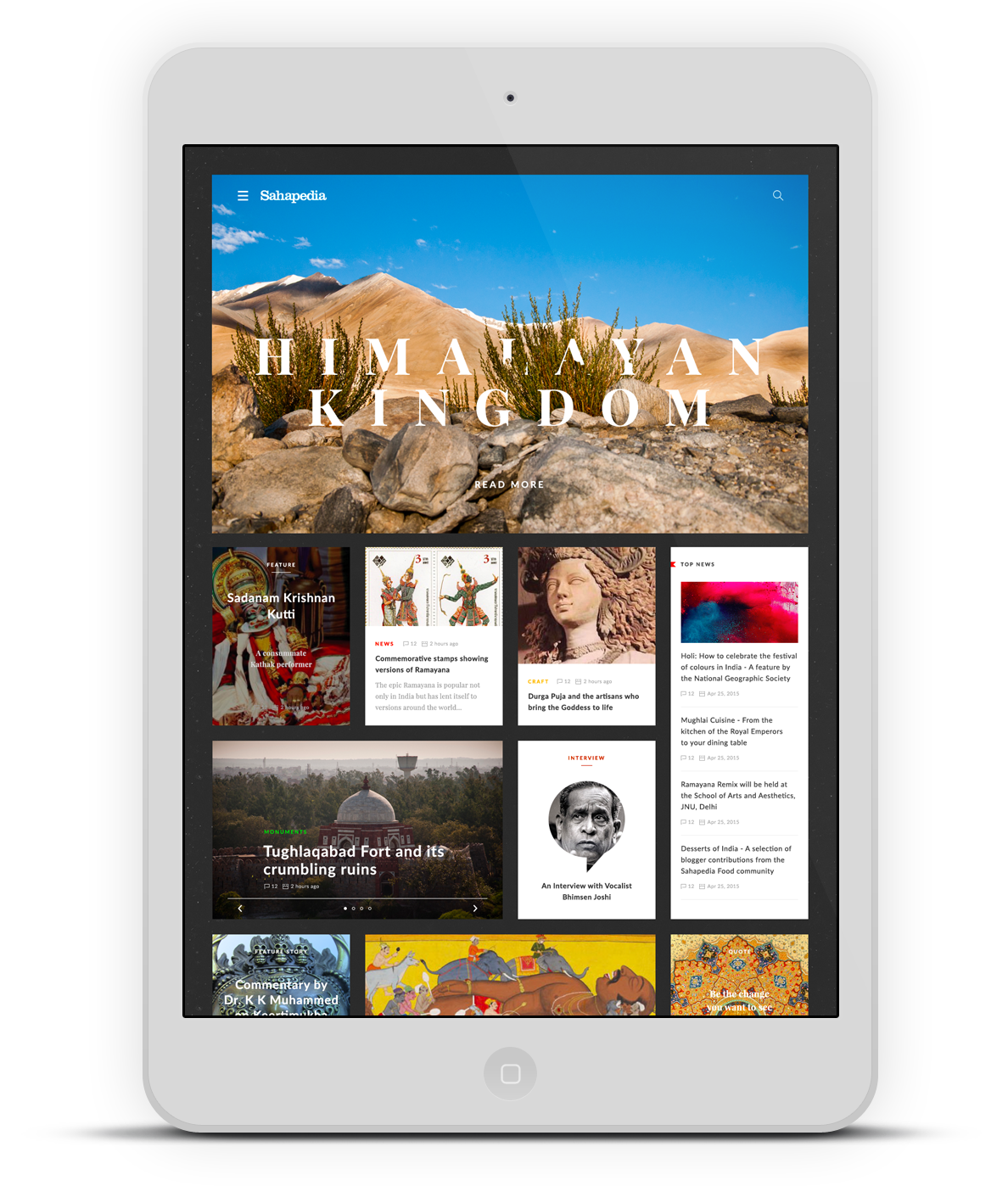
The platform is designed to be visually immersive, with featured content providing entry points to various articles, modules, or curated content. This helps make the content more accessible and appealing, even to users with lower motivation to engage.
Visual search: A better search experience
How do you improve on the ubiquitous Google search experience?
We started by identifying the biggest limitation in the design of Google search - ranked results. When you go with a search result ranking, an algorithm is deciding what you are looking for. But what if you aren't sure of what it is that you're looking for in the first place?
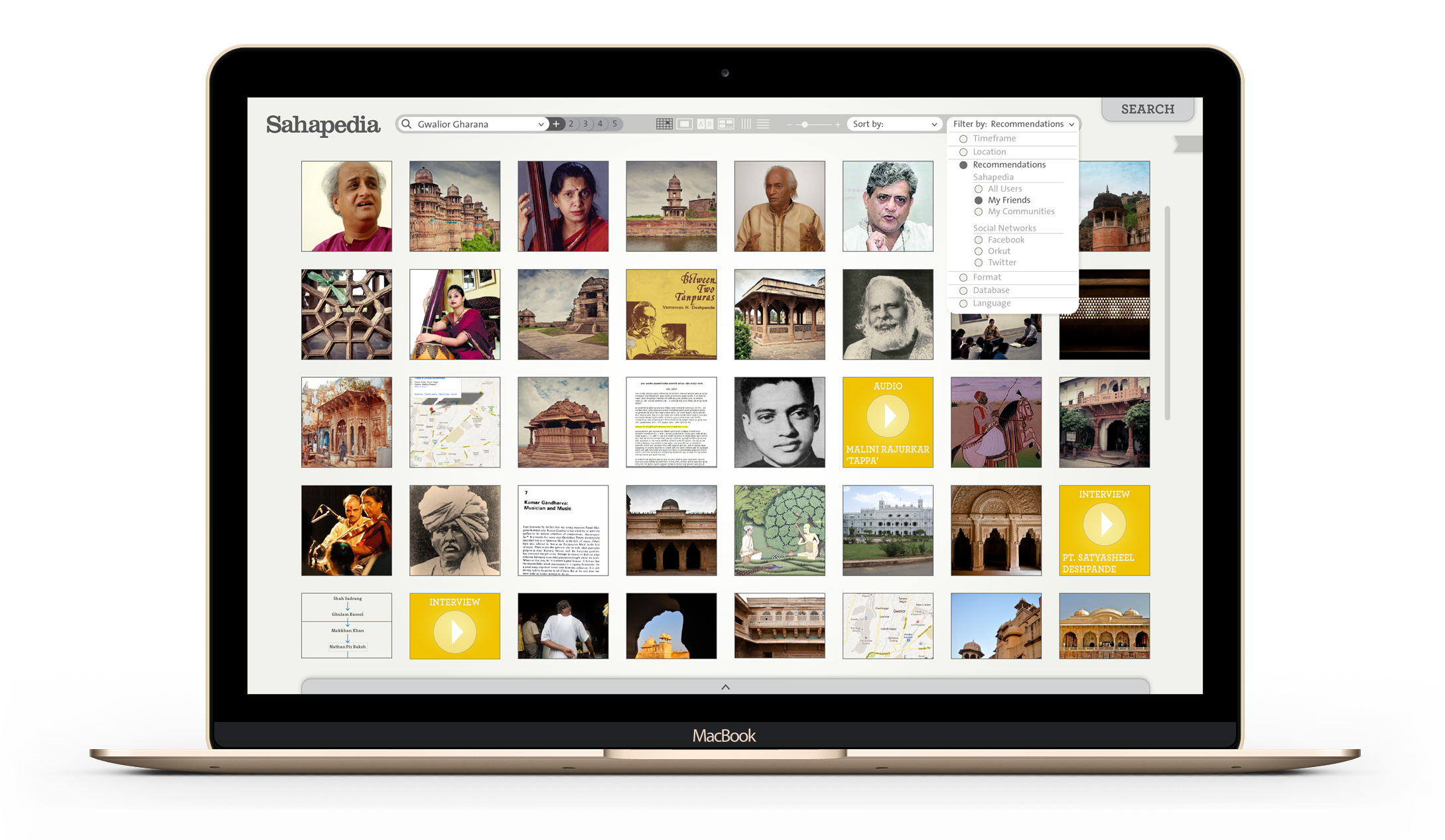
When you're doing research, or just browsing to learn something new, a rankings based search falls short. We reinvented the search experience to support free-form exploration and discovery of content, and also redesigned the concept of search result rankings by introducing relevant filters and sorting tools instead.
Filter and sort your search results
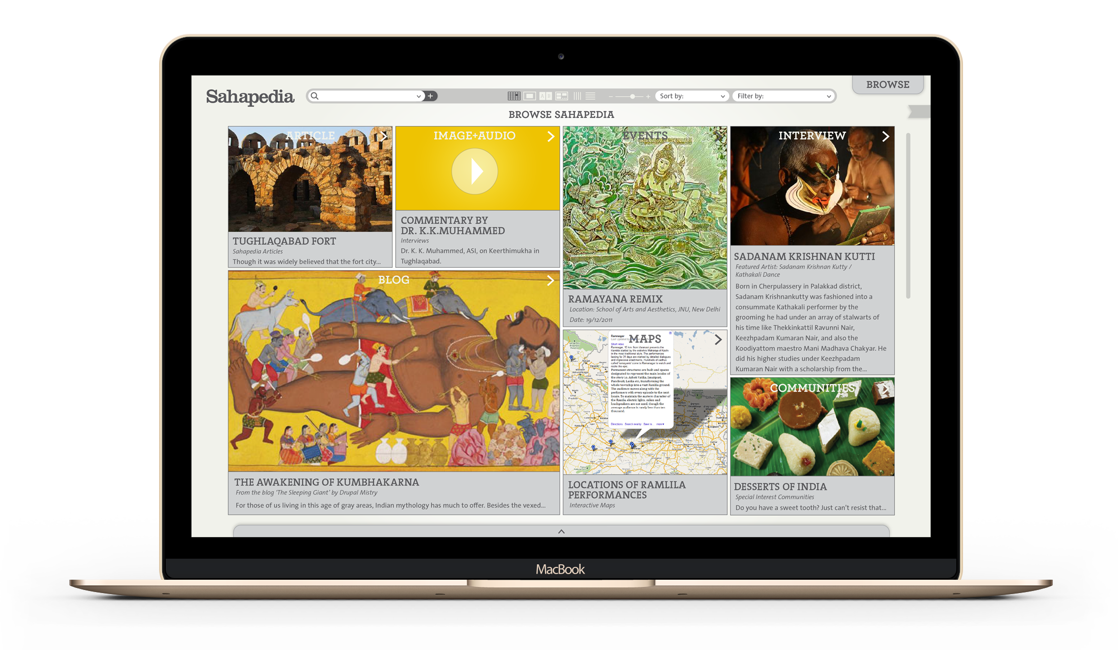
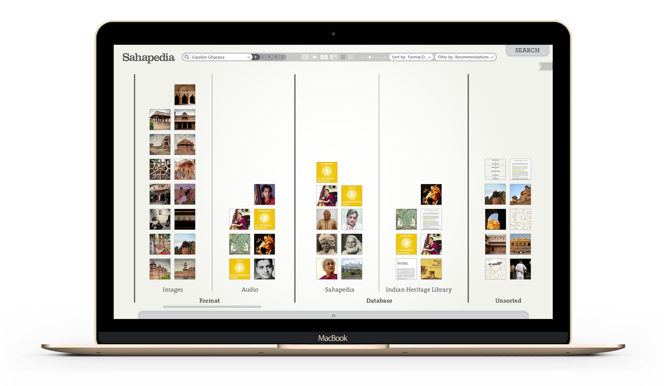
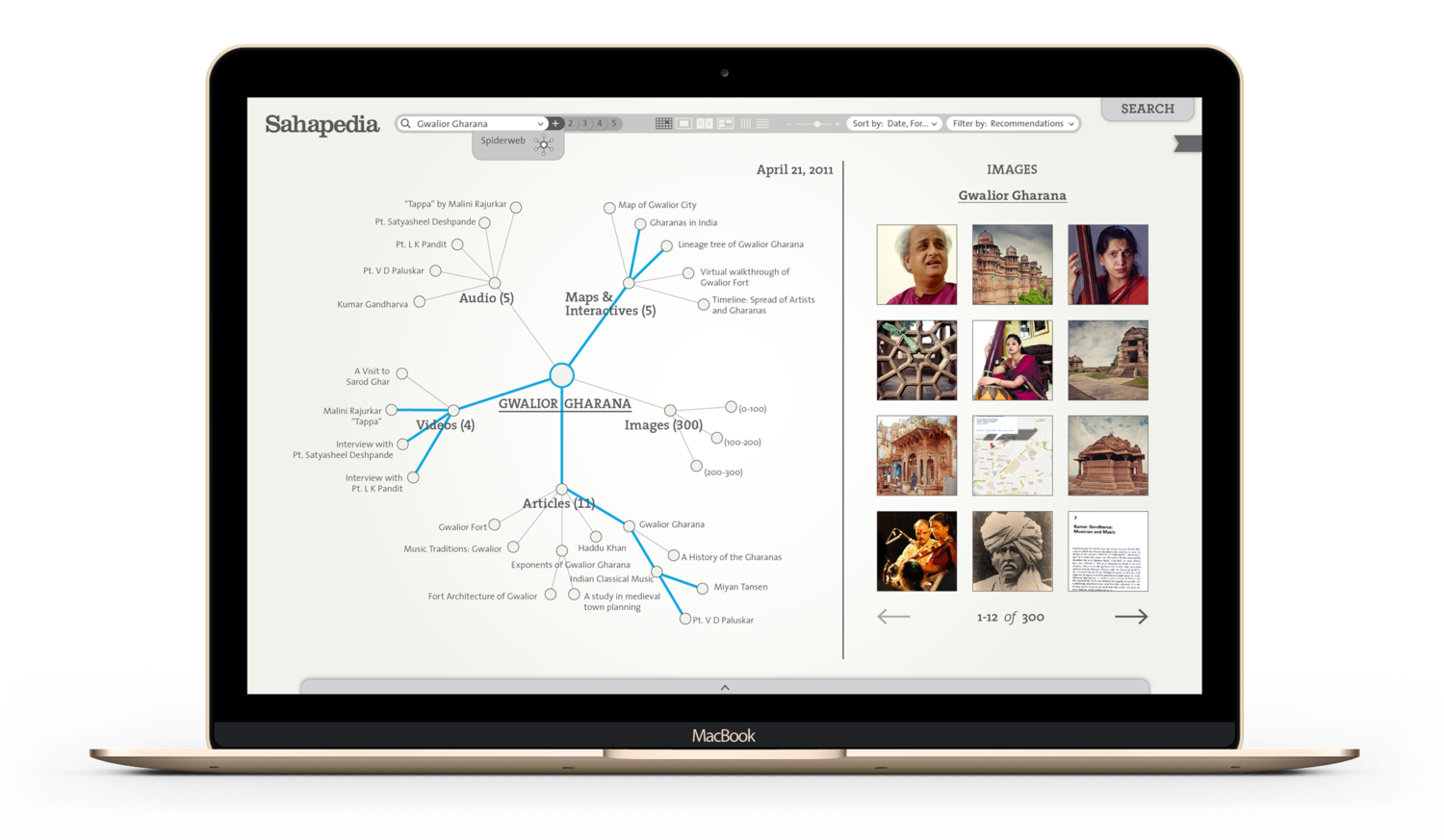
Visually sorting search results by data format allows you to get an overview of the search results - an invaluable asset during research - enabling users to engage with large amounts of information effectively, before committing to any one search result.
Multiple media types can be seen in a visual overview of the search results. Users can filter search results to refine the parameters according to specific requirements, like seeing only video interviews, or search specifically for articles recommended by their peer network.
Interactive Cultural Map
An interactive cultural map of India, that is open to registered users to post to. The usual functionalities of sorting and filtering will be available to help users in navigating the content efficiently.
City-based browsing
Want to know more about a particular city? Sahapedia makes it easy to search and browse for content using a carefully curated list of filters and sorting options.
Article pages
A typical article is shown here, but the formatting of the articles and modules varies depending on the domain selected, and we have designed custom templates to help bring out the best user experience for each domain. For example, for articles related to the Architecture of monuments the recommended templates bring emphasis to visuals and immersive 3-D views, panoramas and video up front.
Workspace
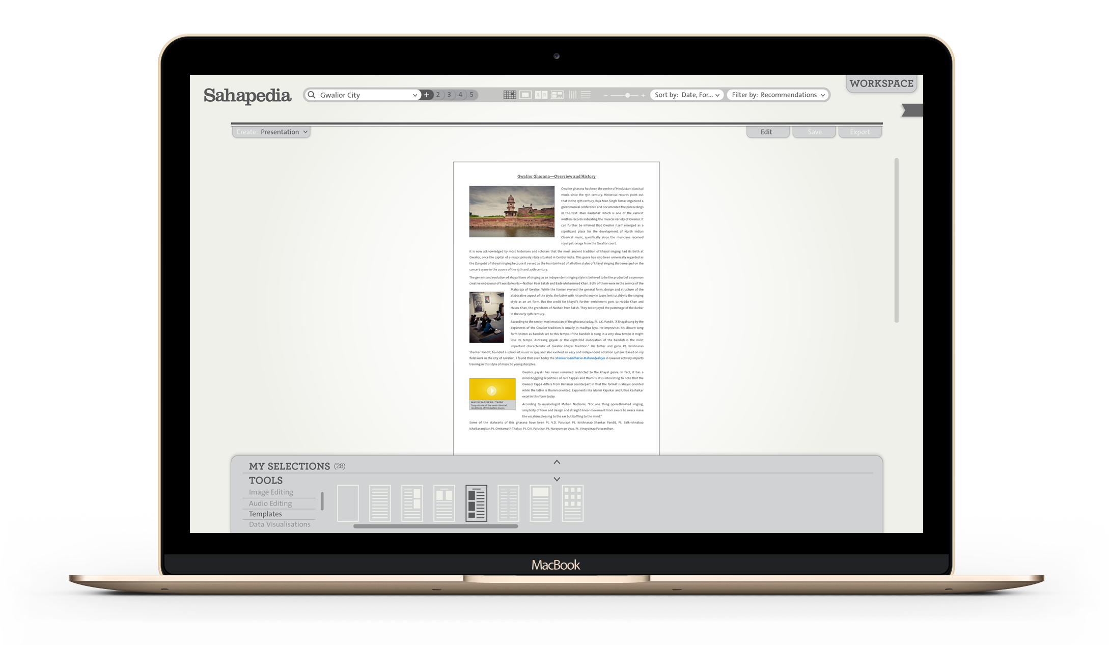
The workspace is available to registered users to create several types of content with previously saved articles or data points. The user may also engage a live-view split-screen research window within the same window for quick reference, and add information live. Some of the content types that a user may create include articles, presentations, interactives, blogs, maps, or debates.
Drag and Drop workflow
Various tools and templates will make it easy to drag and drop data into the presentation, allowing the user freedom to think about the work, rather than be tied down by mundane issues of formatting or style-setting. The templates will offer a great starting point to organize one’s thoughts or structure, and can be adapted for individual preference.
Content first
To manage the complexity of the user experience, we designed the Sahapedia UX to give primacy to content: the UI elements are designed to recede and disappear when possible, and are context-sensitive so that users only see tools and features that are relevant to what they are doing at any given time, both of which reduce the mental and cognitive load on the user, who can focus on the content, instead of having to learn an interface.
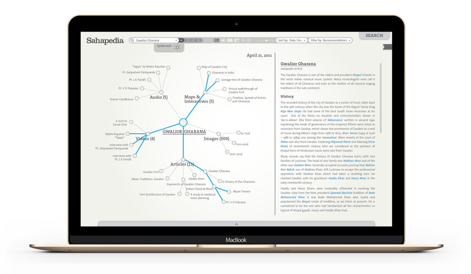
Spiderweb visual search tool
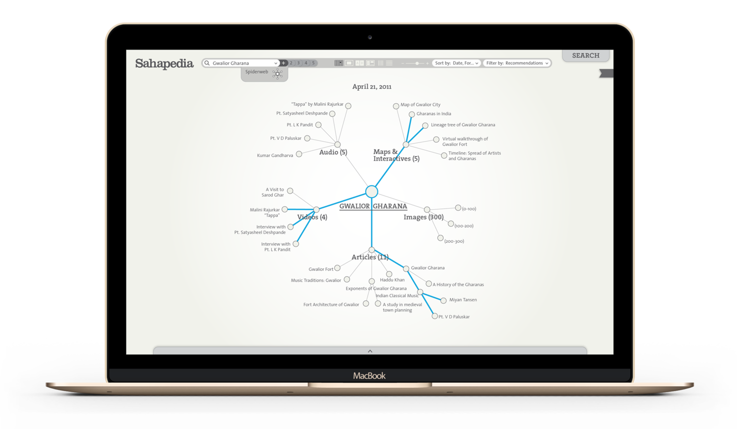
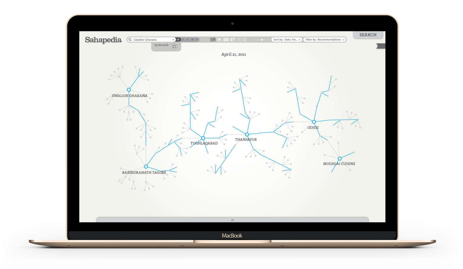
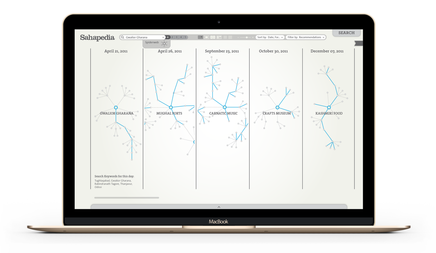
We custom designed a ‘Spiderweb’ tool to enable users to navigate the Sahapedia database visually. By tracing the user’s movements, it will be possible to record their activities and show the user the content he has previously looked at, which will also indicate all the content that she hasn’t looked at yet. It will be possible to use the same powerful sorting and filtering tools in the spiderweb view as well.
The system will preserve the user’s browsing history and the Spiderweb tool can be used to display it visually, instantly creating a mindmap of the user’s research/browsing history. We hope that functionalities like these will start to reveal to users new ways of conducting research and help them to discover new connections.

